Branding
Visual Identity
Package Design
ANLAN
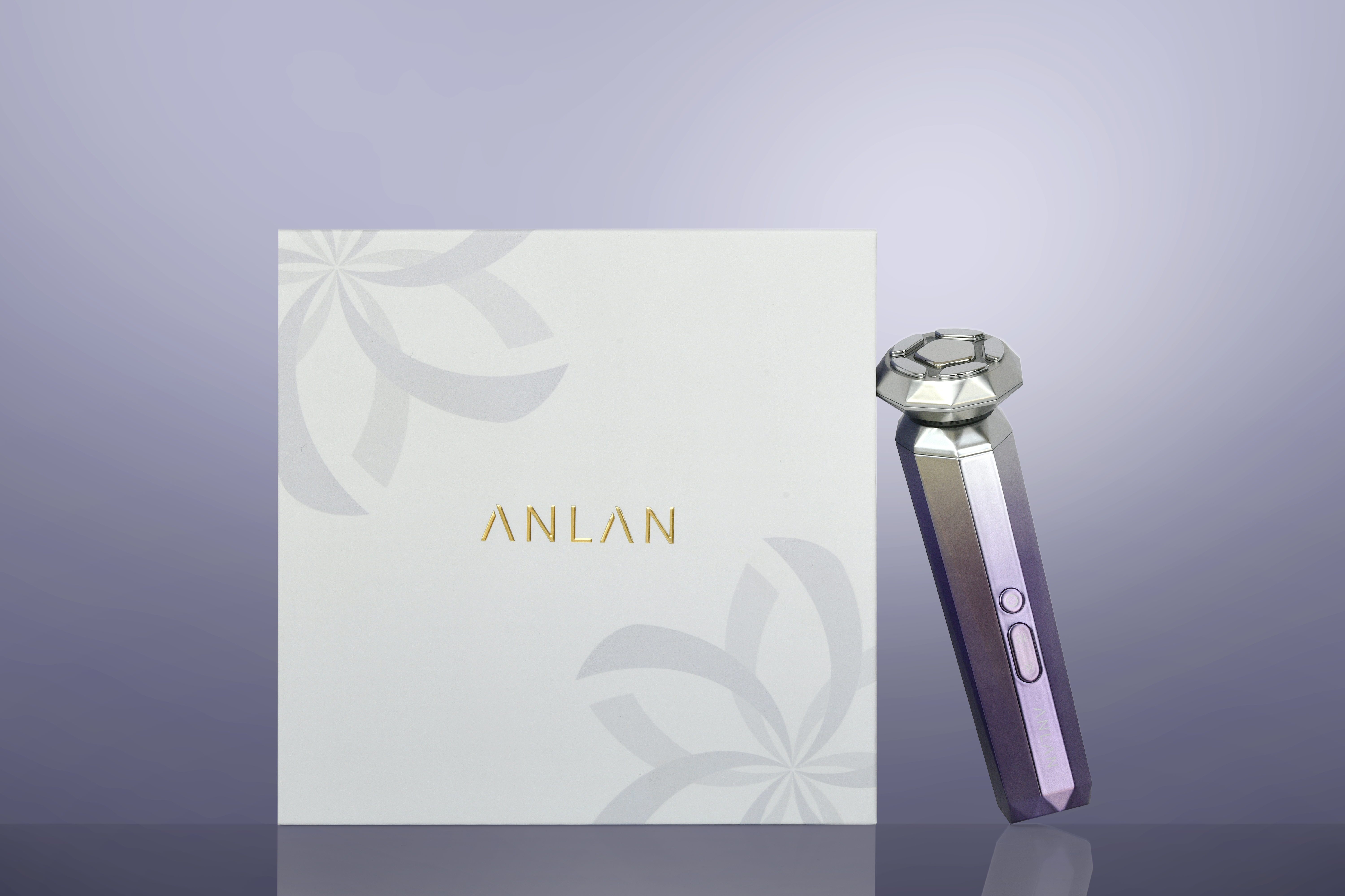
设计重塑了安兰作为美妆品牌的形象,确保了品牌不同场景下的可识别性。为传达刚柔并济的现代女性气质,字体的边角经过精心圆润处理,但整体保持洁干净。从字母A迭代而来的花朵图案以全新的姿态诠释了beauty的含义。品牌主色调紫色大胆而明亮。
设计师希望新的形象能够改变女性美妆品牌的固有认知,带来更独立的感觉。
The design reshapes ANLAN identity as a beaut brand, ensuring its recognizability in different scenarios. To convey the concept of moder femininity of rigidity and softness, the typeface corners are carefully rounded but overall kept simple and clean. A flower pattern iterated from the letter A blooms a new gesture to interpret the meaning of beautv. The purple color as branding main color is brave and bright. Designers hope new identities change th inherent perception of women beauty brands and lead to a more independent feeling.


年份:2021
客户:KENSEN
城市:中国深圳
设计:杨海闻、李嘉良、孟子寻、余梦尧、陈韦薇
摄影:曹达琪、杨海闻
版面:杨海闻
YEAR: 2021
CLIENT: KENSEN
LOCATION: Shenzhen, China
DESIGNER: Gwen Yang, Jialiang Li, Zixun Meng, Weiwei Chen
PHOTOGRAPHER: Daqi Cao, Gwen Yang
LAYOUT: Gwen Yang