Branding
Visual Identity
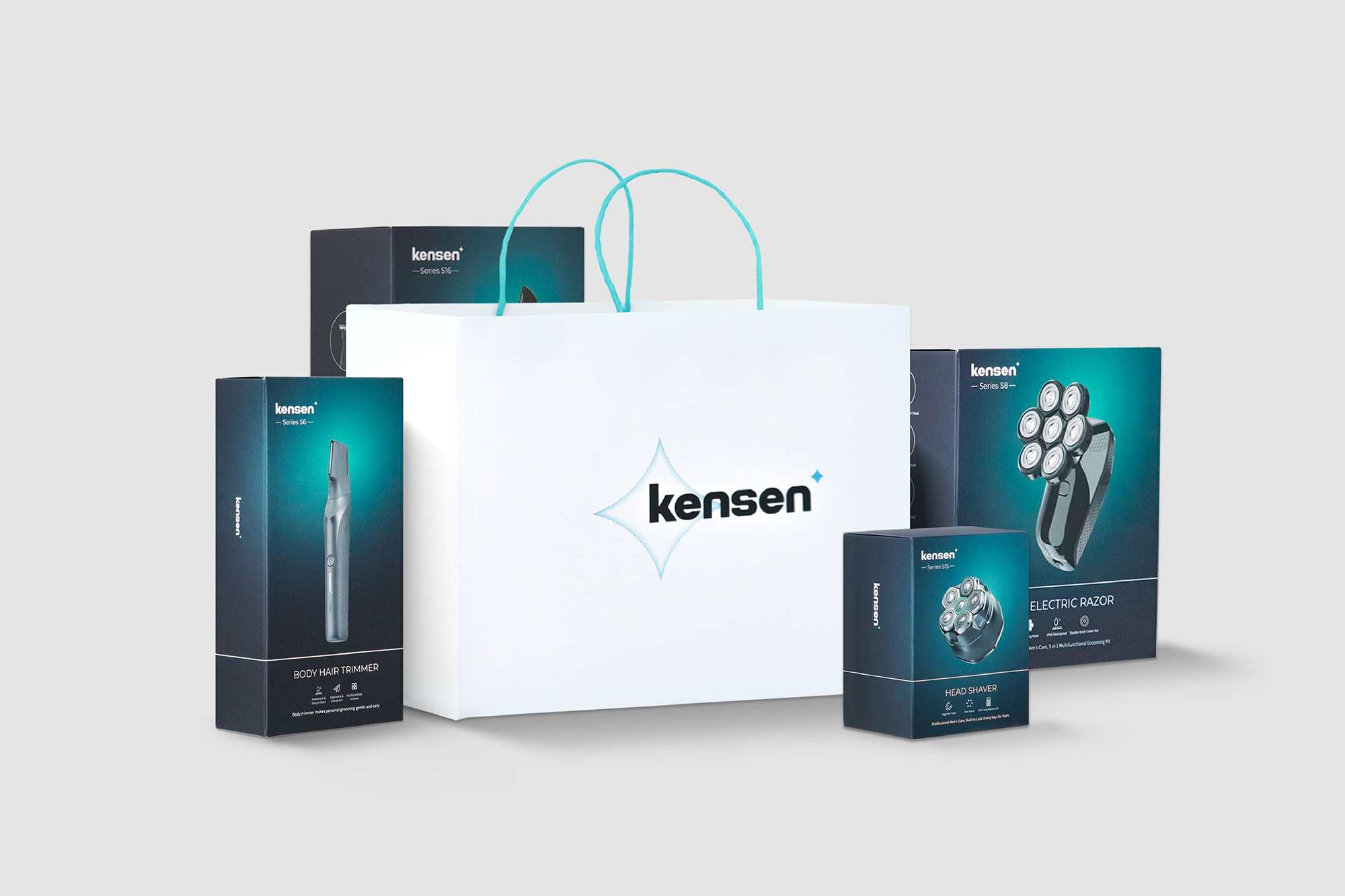
Package Design

KENSEN
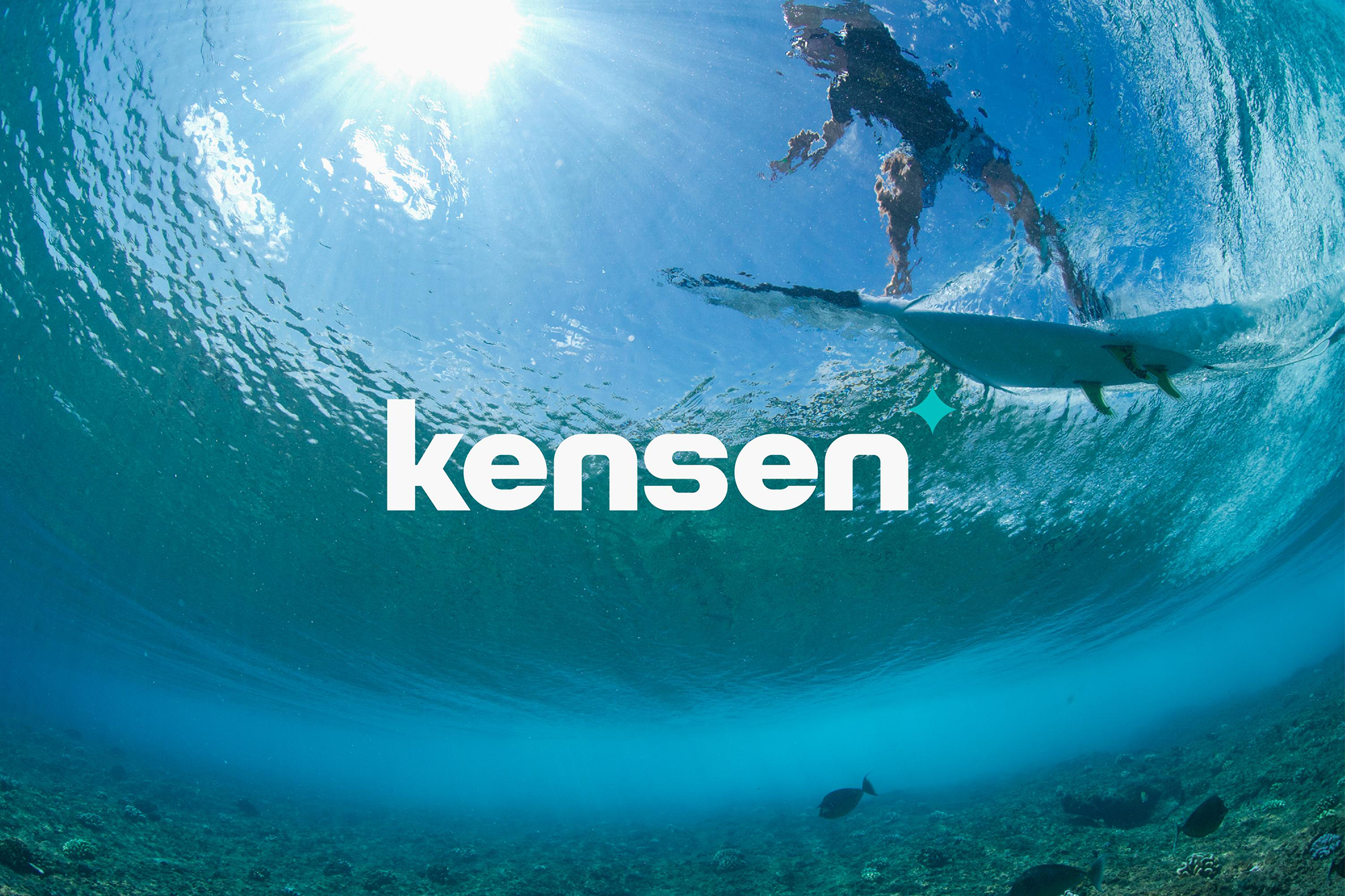
在为男士个人护理品牌KENSEN设计时,我们专注于展现其目标受众的特点和品牌的核心价值。设计中加入了一点“酸性”元素,突出了品牌的活力与独特魅力。这种风格就像是描绘了一个即将步入成熟的男性形象——既有青春的痕迹,又不失成熟男人的韵味。它巧妙地捕捉了内心那份想要留住年轻感觉的愿望,达到了一种恰到好处的平衡,既不过于张扬也不失个性,完美体现了品牌的定位。
In designing for the men's personal care brand KENSEN, we focused on embodying its target audience and brand values. We incorporated a touch of "acidic" design elements to highlight the brand's vitality and unique characteristics. This approach is akin to portraying a male figure on the cusp of maturity—retaining the essence of youth while also embodying the sophistication of a mature man. It captures the brand’s nature, with subtle balance of wanting to hold onto that youthful spirit, achieving a perfect equilibrium that feels just right.


年份:2021
客户:KENSEN
城市:中国深圳
设计:杨海闻、李嘉良、孟子寻、陈韦薇
摄影:拉法·阿里木
版面:王凯丽
YEAR: 2021
CLIENT: KENSEN
LOCATION: Shenzhen, China
DESIGNER: Gwen Yang, Jialiang Li, Zixun Meng, Weiwei Chen
PHOTOGRAPHER: Rafa·Alim
LAYOUT: Kaili Wang