Branding

SYT
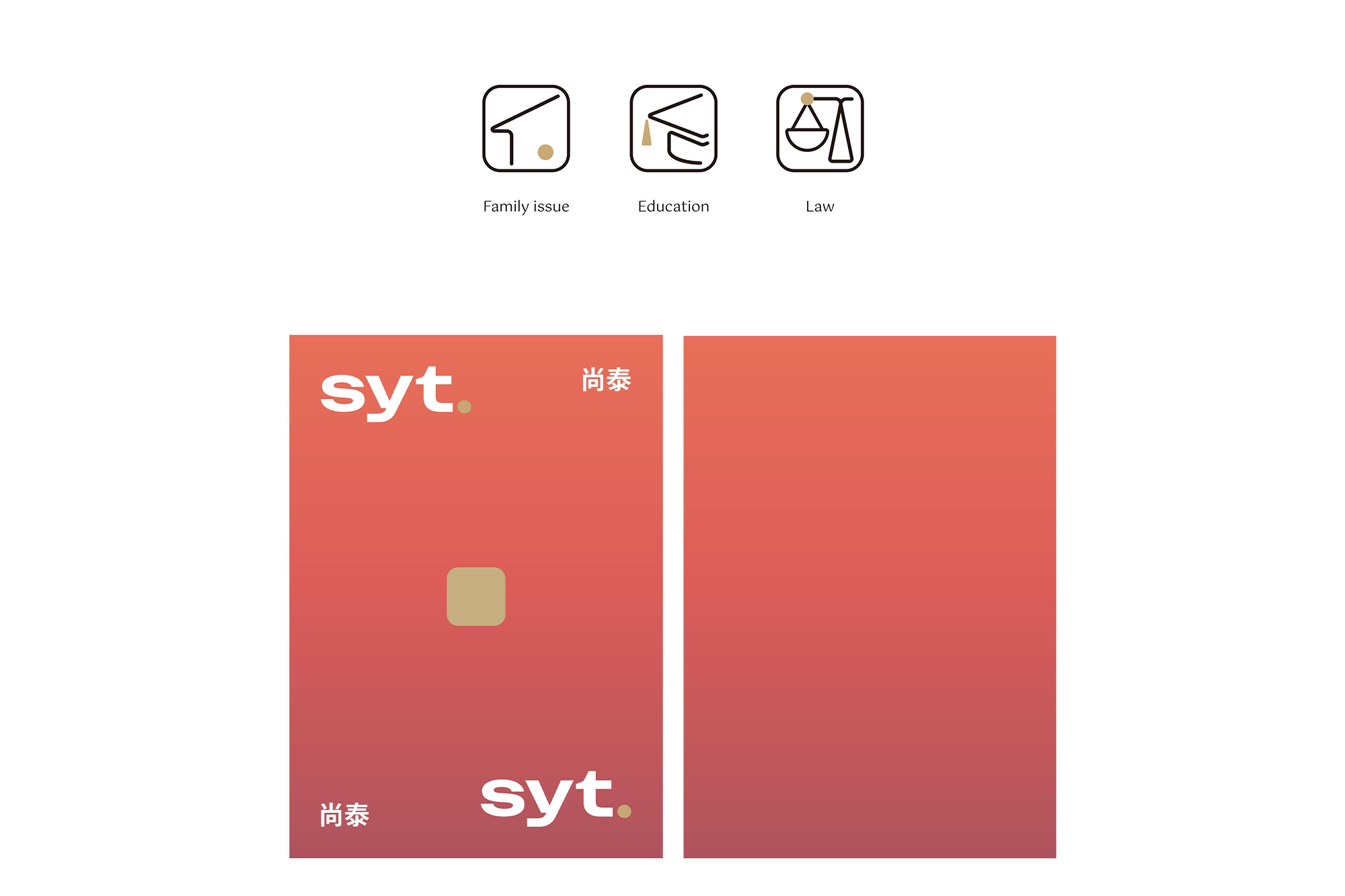
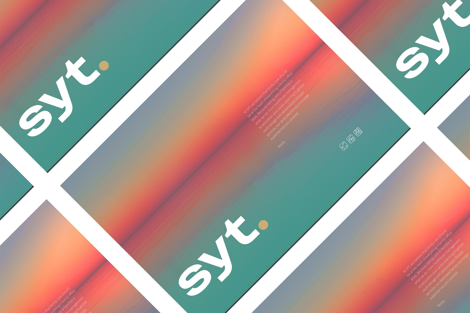
这个为SYT尚泰家族辦公室设计的LOGO,突破了常见的高端商务风格,注重厚重感,以传达更强的信赖感。方块形状代表着“印”的延伸,象征着信任与印记。然而在英文版本中,方块被转化为圆形,以更好地与英文字体相匹配。随之,我们还拓展了一系列icon设计。
This logo, designed for the SYT family office, breaks away from the common high-end business style with a sense of weightiness to convey a sense of trust. The square shape extends from the concept of "Chinese seal," symbolizing trust and family legacy. However, in the English version, the square is transformed into a circle to better match the English font. Along with it, we have also developed a series of icon designs.


年份:2023
客户:尚泰家族辦公室
城市:中国香港
设计:杨海闻
摄影:拉法·阿里木
版面:王凯丽
YEAR: 2023
CLIENT: SYT
CITY: Hong Kong SAR, China
DESIGNER: Gwen Yang
PHOTOGRAPHER: Rafa·Alim
LAYOUT: Kaili Wang